New design for Green Solutions - relaunch of the logo and design elements
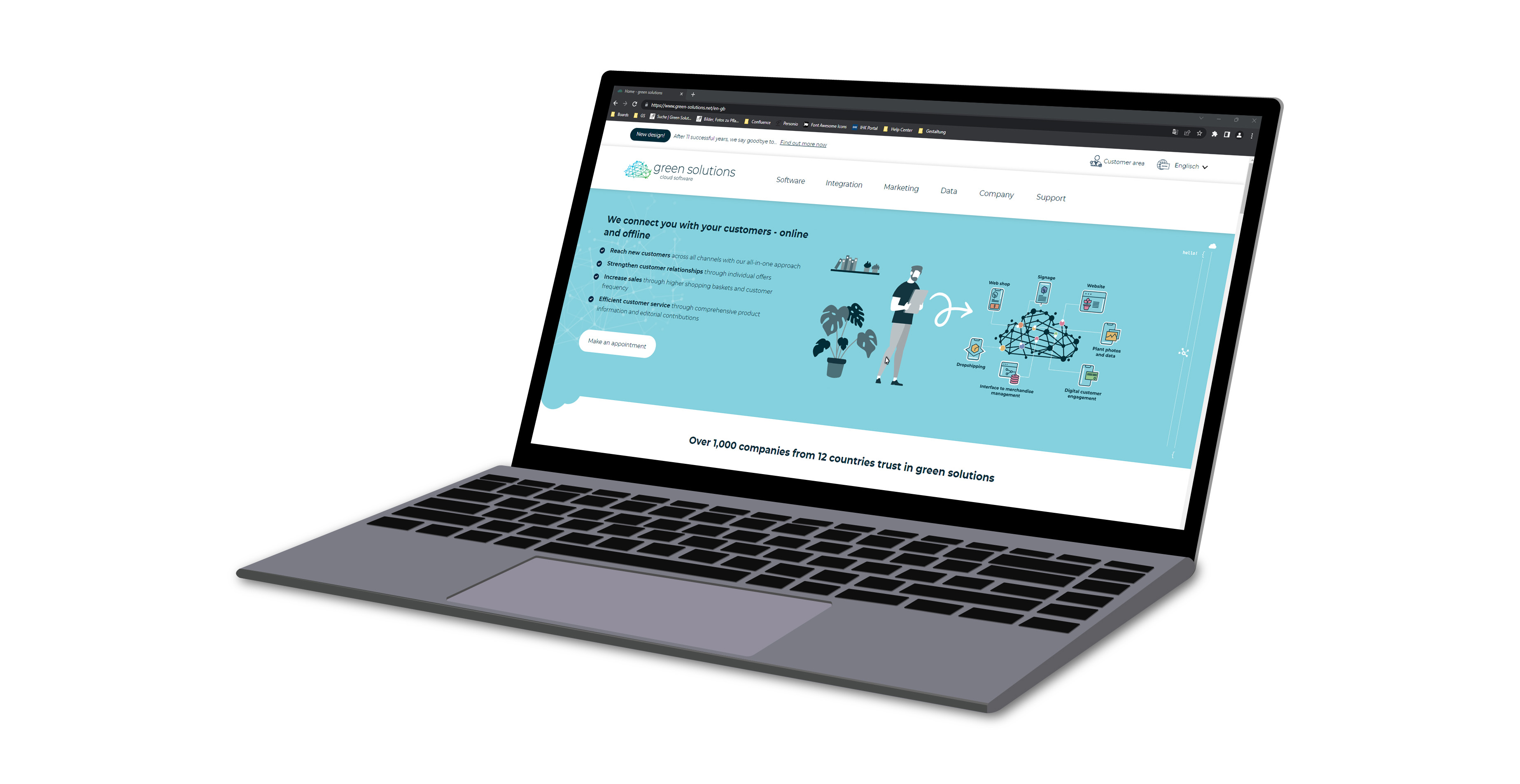
After 11 successful years, we say goodbye to our corporate design and start a new visual beginning. with a new colour scheme, adapted fonts, and changed design elements. Through an expanded strategic orientation based on a new positioning, we will place our product in the future focus of green solutions: Cloud Software. But what does that mean exactly?
Our Cloud Software - the cornerstone of Green Solutions
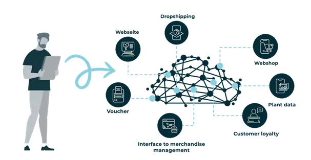
The name of the system, what makes us unique, has evolved over the years: in the beginning, it was simply the database, then a multi-channel system, and later the Omni-Channel System (OCS). Now we are turning hundreds of software products into a holistic all-in-one solution for the horticultural sector: Cloud Software. This puts the focus on our overarching product, with which horticultural businesses can master the challenges of digitalisation with a centralised software solution. This approach will also be reflected in our logo in the future.
The "leaf" becomes a networked cloud - the Cloud Software
We say goodbye to the "leaf," which always stood for specialisation in the industry but also plant data. Here, we want to emphasise our position as a software company in the future and use a symbolic Cloud Software as a logo. The connection of all points illustrates the networking of all software products in the cloud. This means, for example, that products in the web shop are imported into the cloud via merchandise management and enriched with product data and photos.

The Tips and Guides in the web shop are also in the cloud and linked to reports or videos. All your green solutions modules are centrally located in your individual Cloud Software, an application. They are networked with each other and can map your entire online and stationary business processes.
Blue stands for technology and innovation - we are becoming more colourful!
Until now, our colours have been exclusively oriented towards the green sector. A new colour scheme that combines the green sector with our technical focus is more in line with our strategic orientation. In addition to a new light green and a light blue, a dark blue has also found its way into our colour world.
In colour theory, blue stands for technology and innovation - a colour that should not be missing from our corporate design. Nonetheless, because we are still focused on the horticultural industry, the green is present but connected in a gradient with the blue.
Our new typography - clean, simple and dark blue
In addition to a new logo and a new colour scheme, we have also updated the typography. We continue to use a clean and simple font, but it looks much more modern and somewhat more filigree than its predecessor.
The font colour will become dark blue in the future, which results from mixing light blue and light green. The dark blue font colour complements all three colours of our new corporate designs.
Get to know Green Solutions
Are you interested in a free presentation?

- Insight into the Cloud Software functions
- Answers to your questions
- Individual consultation for you and your team
- 100% free of charge


